Table of Contents:
Understanding Paper Texture and Its Impact on Design
Understanding paper texture is crucial for anyone involved in design, whether you're creating stationery, marketing materials, or packaging. The texture of paper not only influences the tactile experience but also plays a significant role in the overall aesthetic appeal of printed materials.
Different textures can evoke various emotions and reactions. For instance, a rough texture might convey a rustic, organic feel, while a smooth texture can suggest elegance and sophistication. This makes choosing the right paper texture an essential part of the design process. Here are some key considerations:
- Brand Identity: The texture should align with the brand's identity and message. A luxury brand may opt for a textured paper like Luxe Kraft or Cream Cashmere to emphasize quality.
- Target Audience: Consider the preferences of the target audience. For example, a younger demographic might appreciate bold and vibrant textures, while a more traditional audience may prefer classic, subtle finishes.
- Purpose of the Design: The intended use of the printed material is critical. For promotional items, a striking texture can help grab attention, while for business stationery, a more understated texture may be appropriate.
Moreover, the combination of texture with color can significantly affect how a design is perceived. A textured paper can enhance color depth, making it appear more vivid and engaging. This interplay between texture and color can lead to stunning designs that leave a lasting impression.
In conclusion, understanding paper texture and its impact on design is fundamental for creating visually appealing and effective printed materials. By thoughtfully selecting textures that align with the brand, audience, and purpose, designers can elevate their work to new heights.
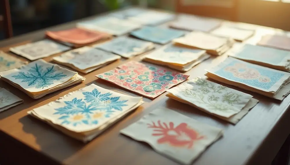
Types of Textured Paper for Stunning Prints
When it comes to achieving stunning prints, the choice of textured paper can make all the difference. Various types of textured paper are available, each offering unique characteristics that enhance the visual and tactile experience of printed materials. Here’s a closer look at some popular types of textured paper:
- Milkshake: This paper features a soft, creamy texture, providing a warm feel that is perfect for invitations and high-end stationery.
- Luxe Kraft: Combining a rustic look with durability, Luxe Kraft is ideal for packaging and promotional materials, giving a unique, organic touch.
- Cotton: Known for its luxurious feel, cotton paper is often used for fine stationery and high-quality prints, offering excellent durability and a premium appearance.
- No Bleach Brown: An eco-friendly option that retains its natural brown color, this paper is great for earthy, organic designs and can be used in various applications from packaging to business cards.
- Verona: This textured paper has a subtle, elegant finish, making it suitable for sophisticated invitations and formal stationery.
- Cream Cashmere: With a soft, luxurious feel, this paper adds a touch of elegance to any project, ideal for high-end marketing materials and invitations.
- Antique Black: This rich, dark paper offers a dramatic background, perfect for striking designs that require a bold statement.
- Perla: With a pearlescent finish, Perla paper adds a shimmering effect to prints, making it a fantastic choice for special occasions.
- Pietra: This stone-like textured paper provides a unique tactile experience, ideal for projects that aim to convey strength and elegance.
- Linen: Mimicking the texture of linen fabric, this paper adds a sophisticated touch to business cards and formal stationery.
- Luxe Silver: Featuring a metallic sheen, Luxe Silver paper is perfect for eye-catching designs that need to stand out, especially in promotional materials.
Each type of textured paper serves a specific purpose and can enhance the overall design of printed materials. By selecting the right texture, designers can create prints that not only look great but also feel exceptional to the touch, leaving a memorable impression on the audience.
Advantages and Disadvantages of Paper Texture in Design
| Advantages | Disadvantages |
|---|---|
| Enhances tactile experience, making designs more memorable. | Can lead to increased printing costs depending on the texture chosen. |
| Evokes specific emotions and feelings that align with brand identity. | May limit the choice of printing techniques that can be used. |
| Adds depth and dimension to designs, creating visual interest. | Some textures may cause issues with readability if not carefully selected. |
| Helps differentiate products in a competitive market. | Texture selection requires careful consideration and knowledge, increasing design complexity. |
| Can enhance color perception, making colors appear richer and more vibrant. | Not all textures are suitable for every type of project or audience. |
The Importance of Texture in Branding Materials
The importance of texture in branding materials cannot be overstated. Texture serves as a critical element that enhances the overall perception of a brand, influencing how consumers feel about products and services. Here’s how texture plays a vital role in branding:
- First Impressions: The texture of a material can create an immediate emotional response. A soft, luxurious texture can evoke feelings of comfort and quality, while a rough or recycled texture might communicate authenticity and eco-friendliness.
- Brand Differentiation: In a crowded marketplace, unique textures can set a brand apart from its competitors. By using distinctive textured paper, brands can create a memorable identity that resonates with their target audience.
- Enhancing Storytelling: Texture can reinforce a brand’s narrative. For example, a brand that focuses on sustainability might use unbleached or recycled paper textures to tell their story, aligning their materials with their values.
- Consistency Across Touchpoints: Using a consistent texture across various branding materials—such as business cards, packaging, and promotional items—creates a cohesive brand experience. This consistency helps build recognition and trust among consumers.
- Influencing Perception of Value: High-quality textures can elevate the perceived value of a product. For instance, using premium textured paper for a product packaging can suggest that the product itself is of superior quality, encouraging consumers to choose it over competitors.
In summary, incorporating texture into branding materials is essential for creating an impactful brand identity. By carefully selecting textures that align with their brand values and resonate with their audience, businesses can enhance their branding efforts and leave a lasting impression.
Creating Depth and Dimension with Paper Texture
Creating depth and dimension with paper texture is a powerful technique that can significantly enhance the visual interest of printed materials. By carefully selecting textured papers, designers can add layers of complexity to their projects, making them more engaging and memorable. Here are some ways to effectively utilize paper texture for depth:
- Layering Techniques: Combining different textures can create a multi-dimensional effect. For instance, pairing a smooth paper with a rougher texture can create contrast that draws the eye and adds visual intrigue.
- Use of Color and Texture Together: The interaction between color and texture can amplify the perception of depth. A textured surface can make colors appear richer and more vibrant, thus enhancing the overall design.
- Strategic Placement: Positioning textured elements in key areas of a design can guide the viewer's eye and emphasize specific details. This technique is particularly effective in marketing materials where the goal is to highlight a product or message.
- Varied Finishes: Utilizing papers with different finishes, such as matte and glossy, can create a sense of layering. For example, a matte textured background with glossy accents can create a striking visual contrast that adds depth.
- Interactive Elements: Textured papers can also add a tactile component to designs, encouraging interaction. This is particularly effective in packaging, where the texture invites consumers to touch and explore the product further.
Incorporating these techniques not only enhances the aesthetic appeal of printed materials but also creates a more immersive experience for the audience. By thoughtfully using paper texture, designers can elevate their work, making it stand out in a competitive landscape.
Choosing the Right Texture for Different Projects
Choosing the right texture for different projects is essential for achieving the desired aesthetic and functional outcomes. The texture of paper can significantly affect not only the look of your designs but also how they resonate with your audience. Here are some considerations to keep in mind when selecting textured paper for various applications:
- Stationery: For personal or corporate stationery, textures like Cotton or Verona can convey elegance and professionalism. A soft, tactile feel enhances the overall impression and invites engagement.
- Marketing Materials: Use textures such as Luxe Kraft or No Bleach Brown to create an earthy, approachable vibe. These textures can help to establish a connection with the audience and make promotional materials more memorable.
- Retail Packaging: In retail settings, the texture can influence buying decisions. Textured papers like Antique Black or Luxe Silver can elevate product packaging, making it feel more luxurious and appealing to consumers.
- Event Invitations: For weddings or special events, choose textured papers like Cream Cashmere or Milkshake to create an inviting and sophisticated look. The right texture can set the tone for the entire event.
- Promotional Items: When creating promotional items, consider using vibrant textured papers that stand out. Textures like Perla can add a unique visual element, enhancing the perceived value of the item.
Ultimately, the key is to align the paper texture with the project's goals and the audience's preferences. By carefully selecting the right texture, you can enhance the effectiveness of your designs and create a more engaging experience for your viewers.
Case Study: Successful Designs Using Textured Paper
Case studies provide valuable insights into the effective use of textured paper in design. Here, we explore a few successful designs that showcase the impact of paper texture in various applications.
- High-End Wedding Invitations: A luxury wedding planner utilized Cream Cashmere textured paper for invitations. The soft, elegant feel of the paper complemented the romantic theme of the wedding, making a lasting impression on the guests. The choice of texture not only elevated the visual appeal but also set the tone for the event.
- Eco-Friendly Packaging: A sustainable brand chose No Bleach Brown textured paper for its product packaging. This choice highlighted the brand's commitment to eco-friendliness while providing a rustic, natural look. The unique texture attracted consumers looking for environmentally conscious products, thereby increasing sales.
- Corporate Marketing Materials: A tech startup employed Luxe Kraft paper for its promotional brochures. The combination of a modern design with a textured finish helped the brochures stand out at trade shows. The tactile experience of the paper engaged potential clients, leading to higher interest in the company’s innovative solutions.
- Retail Displays: A boutique used Antique Black textured paper for its signage and price tags. The deep, rich texture added sophistication to the retail environment, enhancing the overall shopping experience. Customers were drawn to the unique presentation, which resulted in increased foot traffic and sales.
These case studies illustrate how the thoughtful selection of textured paper can enhance the effectiveness of design projects across various industries. By understanding the specific needs of each project, designers can leverage the unique properties of textured paper to create impactful and memorable experiences.
How Texture Influences Color Perception in Printing
Texture plays a pivotal role in influencing color perception in printing, significantly affecting how colors are viewed and experienced by the audience. The interaction between texture and color can create a dynamic visual experience, enhancing the overall appeal of printed materials. Here are some key factors to consider:
- Light Reflection: Different textures interact with light in unique ways. For example, a glossy texture reflects more light, making colors appear brighter and more vibrant. In contrast, a matte texture absorbs light, which can soften colors and create a more subdued appearance.
- Depth and Dimension: Textured surfaces can add depth to colors, making them seem more layered and complex. For instance, a paper with a linen texture may give a color a richer, more tactile quality, enhancing its visual interest.
- Color Saturation: The perceived saturation of a color can be influenced by the underlying texture. A rough texture might make colors appear less saturated, while a smooth surface can enhance the vividness of colors, making them pop.
- Emotional Impact: The texture can evoke different feelings that, combined with color, can strengthen the emotional response to a design. For instance, a warm, textured paper can make colors feel more inviting and comforting, while a cold, sleek texture might convey a sense of modernity and professionalism.
- Brand Perception: The combination of color and texture can reinforce brand identity. A brand that uses a specific textured paper with a unique color palette can create a strong, recognizable visual signature that resonates with its audience.
In conclusion, understanding how texture influences color perception is essential for designers aiming to create impactful printed materials. By thoughtfully selecting both texture and color, designers can craft designs that not only look stunning but also communicate the intended message effectively.
Integrating Texture into Stationery and Marketing Materials
Integrating texture into stationery and marketing materials is a strategic approach that can elevate the overall design and effectiveness of these items. By selecting the appropriate textured paper, designers can enhance the visual appeal and tactile experience, creating a more engaging interaction with the audience. Here are some key points to consider:
- Enhancing Brand Identity: Textured paper can reinforce a brand's image. For instance, a luxury brand may opt for Cream Cashmere or Luxe Silver to convey sophistication, while a creative business might choose Luxe Kraft to emphasize its artistic flair.
- Creating Emotional Connections: The tactile nature of textured paper can evoke emotions, making the stationery feel more personal and relatable. This is particularly important for invitations and personalized notes, where the texture can add warmth and sincerity.
- Improving Readability: Certain textures can enhance readability in marketing materials. For example, using a subtle texture can create a pleasing backdrop for text, making it easier for viewers to absorb the information presented.
- Differentiating Products: In a competitive market, textured paper can help a product stand out on shelves. For packaging, a unique texture can attract attention and encourage consumers to pick up the product, enhancing the likelihood of purchase.
- Encouraging Interaction: Textured stationery invites touch, which can lead to a more memorable experience. When recipients engage with the material, they are more likely to form a connection with the brand or message.
In conclusion, integrating texture into stationery and marketing materials is not just about aesthetics; it is a powerful tool for enhancing communication and building relationships with the audience. By thoughtfully selecting textured papers, designers can create impactful materials that leave a lasting impression.
The Role of Texture in Packaging Design
The role of texture in packaging design is crucial for creating products that stand out on the shelf and resonate with consumers. Textured packaging not only enhances visual appeal but also adds a tactile element that can influence purchasing decisions. Here are several key aspects of how texture impacts packaging design:
- Brand Recognition: Unique textures can help establish a brand identity. For instance, using Luxe Kraft or Cotton textured paper can evoke a natural, eco-friendly image, appealing to environmentally conscious consumers.
- Consumer Engagement: Textured surfaces encourage interaction. When consumers feel a package, they are more likely to engage with the product, leading to a stronger connection with the brand.
- Perceived Value: High-quality textures can enhance the perception of a product's value. For example, packaging made from Cream Cashmere or Antique Black can communicate luxury and exclusivity, justifying a higher price point.
- Functional Benefits: Beyond aesthetics, certain textures can serve practical purposes. For instance, a textured surface can provide better grip, making it easier for consumers to handle products, especially in a retail environment.
- Storytelling: The choice of texture can help tell a brand's story. Using recycled materials or textured finishes can convey a commitment to sustainability, resonating with consumers who value environmentally friendly practices.
In conclusion, integrating texture into packaging design is not merely an aesthetic choice; it is a strategic decision that can enhance brand identity, engage consumers, and elevate perceived value. By carefully selecting the right textures, brands can create packaging that not only attracts attention but also fosters lasting connections with their audience.
Tips for Selecting Textured Paper for Events and Promotions
Selecting the right textured paper for events and promotions is crucial for creating memorable experiences that resonate with your audience. Here are some tips to guide your choice:
- Understand the Event Theme: Consider the theme and atmosphere of the event. For formal occasions like weddings, opt for luxurious textures such as Cream Cashmere or Verona to convey elegance. For casual events, a more relaxed texture like Luxe Kraft can be suitable.
- Consider the Audience: Think about the preferences and expectations of your target audience. Younger audiences may be attracted to bold and vibrant textures, while older demographics might appreciate classic and subtle finishes.
- Match Texture with Purpose: The texture should align with the purpose of the promotional material. For invitations, a textured paper can enhance the invitation's importance, while for flyers, a lightweight and easily readable texture can improve clarity.
- Experiment with Color and Texture Combinations: The interplay between color and texture can create a unique visual appeal. Test different combinations to find what best represents your brand and message. For instance, pairing a rich color with a textured background can create depth and interest.
- Focus on Quality: High-quality textured paper can elevate the perceived value of your promotional materials. Invest in premium options, as they leave a lasting impression on recipients, encouraging them to engage with your brand.
- Plan for Practicality: Consider the functionality of the paper. Ensure it can be printed on effectively and is suitable for the event's needs, whether it's durability for outdoor events or a tactile experience for handouts.
By following these tips, you can select textured paper that enhances your event and promotional materials, making them more impactful and memorable for your audience.
Enhancing Visual Appeal with Luxurious Paper Finishes
Enhancing visual appeal with luxurious paper finishes can transform ordinary designs into extraordinary ones. The choice of paper finish not only affects aesthetics but also influences how the audience perceives the quality of the product. Here are some ways to effectively utilize luxurious paper finishes:
- Utilize Metallic Finishes: Incorporating metallic paper such as Luxe Silver can add a touch of glamour and sophistication. This finish is particularly effective for high-end marketing materials, invitations, and packaging, making them stand out.
- Explore Textured Surfaces: Textured finishes like Linen or Pietra can create a tactile experience that engages the senses. These surfaces add depth to printed materials, making them more inviting and memorable.
- Experiment with Gloss and Matte: The interplay between glossy and matte finishes can create striking contrasts. A glossy finish can enhance vibrant colors, while a matte finish can lend a sophisticated, understated look. Combining these finishes can draw attention to key elements of the design.
- Consider Eco-Friendly Options: Luxurious doesn’t have to mean non-sustainable. Options like No Bleach Brown or recycled textured papers can provide an upscale feel while appealing to environmentally conscious consumers. This approach can enhance brand image and attract a wider audience.
- Incorporate Foil Stamping: Foil stamping on textured or smooth paper can add a luxurious touch that captures attention. This technique works well for logos, headings, or decorative elements, elevating the overall design and reinforcing brand identity.
By thoughtfully selecting luxurious paper finishes, designers can significantly enhance the visual appeal of their projects. This attention to detail not only attracts the eye but also conveys a sense of quality and care, leaving a lasting impression on the audience.
Balancing Texture and Functionality in Design Choices
Balancing texture and functionality in design choices is essential for creating effective printed materials that not only look appealing but also serve their intended purpose. When selecting textures, designers must consider how these choices impact usability without compromising aesthetic appeal. Here are some strategies to achieve this balance:
- Assess the End Use: Understand the primary function of the printed material. For example, if creating business cards, a texture that enhances grip can be beneficial, ensuring that the card feels secure in hand while still looking professional.
- Prioritize Readability: When incorporating texture, ensure that it does not detract from the readability of the text. Textured backgrounds should complement the text color and style, maintaining clear visibility and legibility.
- Consider Durability: Choose textures that enhance the durability of the product, particularly for items that will be handled frequently, such as promotional materials or packaging. Textured papers can add strength while also providing a tactile experience.
- Test User Interaction: Conduct user testing to see how the texture influences the audience's interaction with the material. Gather feedback on how the texture affects their perception and usability, making adjustments based on their responses.
- Maintain Brand Consistency: Ensure that the chosen textures align with the brand’s overall identity. This consistency reinforces the brand message while also ensuring that functional aspects, such as usability, are not sacrificed for style.
By thoughtfully balancing texture and functionality, designers can create printed materials that are not only visually captivating but also practical and effective in achieving their intended goals. This approach ultimately leads to a better user experience and reinforces the brand's message.
Experimenting with Layering Textures for Unique Effects
Experimenting with layering textures can create unique effects that elevate the overall design of printed materials. By thoughtfully combining different textures, designers can produce visually striking results that engage the audience on multiple levels. Here are some strategies for effectively layering textures:
- Choose Complementary Textures: When layering textures, select materials that complement each other. For instance, pairing a smooth finish with a rough texture can create contrast that draws attention and adds depth to the design.
- Varying Thickness: Incorporate papers of different thicknesses to create a dynamic interplay of textures. Thicker papers can provide a sturdy base, while thinner layers can add delicate details, resulting in a more complex visual experience.
- Utilize Transparency: Experiment with translucent papers to layer textures without overwhelming the design. This approach allows underlying textures to subtly influence the overall look while maintaining clarity in the design elements.
- Incorporate Patterns: Layering textured papers with different patterns can create intriguing visual effects. For example, a linen-textured paper paired with a patterned overlay can add richness and complexity to the design.
- Focus on Color Interaction: Consider how colors interact when layered. Different textures can alter the perception of color, enhancing its vibrancy or softness. This can be particularly effective when using colored textured papers as the base layer.
By experimenting with these techniques, designers can create layered textures that not only enhance the visual appeal of their projects but also provide a tactile experience that engages the audience. This innovative approach can set designs apart, making them memorable and impactful.
Conclusion: The Lasting Impression of Textured Printing
In conclusion, the lasting impression of textured printing can profoundly impact how a brand is perceived and how its message is received. The tactile and visual qualities of textured paper not only enhance the aesthetic appeal of printed materials but also create a deeper connection with the audience. When executed thoughtfully, textured printing can elevate marketing efforts, making them more memorable and effective.
As designers and brands explore the various options available, including luxurious finishes and innovative layering techniques, they unlock the potential to engage consumers in new ways. The careful selection of texture can convey emotions, tell stories, and reinforce brand values, ultimately leading to a stronger market presence.
To maximize the benefits of textured printing, it's essential to remain mindful of the audience's preferences and the specific goals of each project. By striking the right balance between visual appeal and functionality, brands can ensure that their printed materials leave a lasting impression that resonates long after the initial encounter.
FAQ on Enhancing Design with Paper Printing Texture
What is the importance of texture in paper printing?
Texture in paper printing adds tactile and visual interest, enhancing the overall appeal of designs. It influences the emotional response of the audience and helps in brand differentiation.
How does paper texture affect color perception?
Different paper textures can alter how colors are perceived. Glossy textures tend to make colors appear more vibrant, while matte textures can soften and mute colors, creating different visual effects.
What types of projects benefit from using textured paper?
Textured paper is ideal for various projects such as business cards, marketing materials, event invitations, and packaging, as it enhances aesthetic appeal and communicates brand values.
Can texture influence the tactile experience of printed materials?
Yes, texture greatly influences the tactile experience. Textured papers invite touch, making the interaction more engaging and memorable for the audience.
How can designers choose the right texture for their projects?
Designers should consider the project's purpose, brand identity, target audience preferences, and the emotional response they wish to evoke when selecting the appropriate texture for their designs.


