Table of Contents:
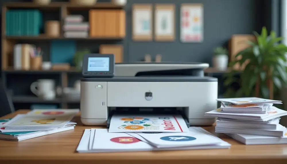
Best File Formats for Printing Signs
When it comes to printing signs, selecting the right file format is crucial for achieving high quality and clarity. Here’s a breakdown of the best file formats for this purpose:
PDF (Portable Document Format): The PDF format is often considered the gold standard for printing signs. It preserves the layout, fonts, and images exactly as intended, ensuring that your design looks the same in print as it does on screen. PDFs also support high-resolution images without significantly increasing file size, making them perfect for detailed graphics and text.
EPS (Encapsulated PostScript): EPS files are ideal for vector-based graphics, such as logos and illustrations. The beauty of EPS is that it can be scaled to any size without losing quality, which is essential for signs that may be printed in various dimensions. This format is particularly useful when working with professional graphic designers or when you need to ensure that your artwork remains crisp at any size.
SVG (Scalable Vector Graphics): SVG is a versatile vector format often used for web graphics but also works well for printing. It allows for scalability and can be edited easily in vector graphic software. This format is particularly beneficial for simple designs with solid colors and sharp lines.
AI (Adobe Illustrator): If you're creating your sign in Adobe Illustrator, saving your work in the AI format is a good option. This format retains all the editing capabilities and layers, allowing for easy adjustments before finalizing the print file. However, it's worth noting that some printers may require the file to be exported as a PDF or EPS for compatibility.
Choosing the right format can significantly impact the final outcome of your printed signs. Each format serves a specific purpose, so consider the nature of your design and the printing requirements when making your selection.
Understanding Raster vs. Vector File Types
Understanding the distinction between raster and vector file types is essential for anyone involved in graphic design and printing. Each type has unique characteristics that influence the quality and suitability for different printing applications.
Raster Files: Raster images are composed of pixels, which are tiny squares of color. This format is excellent for detailed images like photographs, as it can capture complex color variations. However, the downside is that raster files can lose quality when resized. When you scale a raster image beyond its original dimensions, you may notice pixelation, which makes the image appear blurry or jagged. Common raster formats include:
- JPEG
- PNG
- TIFF
It's important to choose a high-resolution raster image (at least 300 DPI for print) to minimize quality loss during printing. Yet, keep in mind that even high-resolution raster files can’t be resized indefinitely without compromising their clarity.
Vector Files: Unlike raster files, vector graphics are based on mathematical equations that define shapes, lines, and colors. This means that vector images can be scaled to any size without losing quality, making them ideal for logos, typography, and illustrations. Since they are resolution-independent, vector files retain their sharpness and clarity at any size. Common vector formats include:
- EPS (Encapsulated PostScript)
- SVG (Scalable Vector Graphics)
- AI (Adobe Illustrator)
When creating signs or any graphics that require resizing, using vector formats is usually the best choice. This flexibility allows for various applications, whether you need a small business card or a large billboard.
In summary, understanding the differences between raster and vector file types helps you select the appropriate format for your specific printing needs. Choosing wisely can greatly enhance the quality and effectiveness of your printed materials.
Comparison of File Formats for Printing Signs
| File Format | Type | Advantages | Disadvantages |
|---|---|---|---|
| Vector/Raster | Preserves layout and quality, supports high-resolution images | File size may increase with detailed graphics | |
| EPS | Vector | Scalable without quality loss, ideal for logos and illustrations | May not be compatible with all printers |
| SVG | Vector | Editable, scalable, works well for simple designs | Not suitable for complex raster images |
| AI | Vector | Retains editing capabilities and layers | May require export to PDF or EPS for printing |
| JPEG | Raster | Widely supported, good for detailed images | Quality loss during resizing, not suitable for text |
| PNG | Raster | Supports transparency, higher quality than JPEG | File size can be larger, limited compression options |
Importance of Color Modes in Printing
The choice of color mode plays a pivotal role in the quality of printed materials. Understanding the differences between RGB and CMYK color modes can greatly influence the final appearance of your signs.
RGB (Red, Green, Blue) is an additive color model primarily used for digital displays. It works by combining red, green, and blue light to create a broad spectrum of colors. While RGB is ideal for screens and online graphics, it is not suitable for printing. This is because printers do not use light to create colors; they use ink. Consequently, colors that look vibrant on a screen may appear dull or inaccurate when printed.
CMYK (Cyan, Magenta, Yellow, Black), on the other hand, is a subtractive color model used specifically for printing. In this model, colors are created by subtracting varying percentages of cyan, magenta, yellow, and black inks from white paper. This method allows for a more accurate representation of colors in printed materials. Using CMYK ensures that the colors in your printed sign closely match what you see on your design software.
When preparing your files for print, it’s crucial to convert your color mode from RGB to CMYK. This conversion helps avoid unexpected color shifts that can occur during the printing process. Many design programs allow you to set your color mode before you start your project, making it easier to maintain color consistency.
Here are some tips for working with color modes:
- Always design in CMYK when creating print materials.
- Check the printer’s color profile to ensure compatibility with your design.
- Use color swatches or samples to verify how colors will appear when printed.
By understanding and utilizing the correct color modes, you can maximize the visual impact of your printed signs and ensure they convey your intended message effectively.
Tips for Converting Files for Optimal Quality
Converting files for optimal quality is a critical step in ensuring that your printed materials look professional and visually appealing. Here are some effective tips to help you achieve the best results:
- Use High-Resolution Images: Always start with high-resolution images, especially for raster formats. Aim for at least 300 DPI (dots per inch) for print to ensure clarity and detail.
- Convert Color Modes Appropriately: As previously discussed, ensure that you convert your files from RGB to CMYK before printing. This conversion is vital for maintaining color fidelity in the final print.
- Flatten Layers: If you’re using design software with layers, consider flattening your image before exporting. This can help prevent any unexpected issues with transparency or overlapping elements when printed.
- Embed Fonts: When working with text in your designs, make sure to embed fonts in your final file. This prevents any changes in font appearance or substitution issues when the file is opened on different systems.
- Check Print Settings: Before exporting your file, double-check the print settings in your design software. Ensure the correct paper size and type are selected to avoid scaling issues during printing.
- Use Appropriate Compression Settings: If your software allows for compression, select settings that balance quality and file size. Avoid excessive compression, as it can lead to pixelation or loss of detail.
- Test Print: If possible, conduct a test print of your design. This allows you to see how the colors and details come out on paper, and you can make adjustments if necessary.
By following these tips, you can significantly enhance the quality of your printed materials, ensuring they meet professional standards and effectively communicate your message.
Common File Format Mistakes to Avoid
When preparing files for printing, avoiding common mistakes can save you time, money, and frustration. Here are some key pitfalls to steer clear of:
- Neglecting Resolution: One of the most frequent errors is using low-resolution images. Ensure your images are at least 300 DPI for print quality. Using lower resolutions can lead to pixelation and blurriness.
- Ignoring Color Profiles: Failing to set the correct color profile can result in unexpected color shifts. Always use the CMYK color mode for print files to ensure accurate color reproduction.
- Inconsistent File Formats: Using various file formats can create compatibility issues. Stick to recommended formats like PDF, EPS, or AI for your designs to maintain quality and ease of printing.
- Forgetting to Outline Fonts: If you're using custom fonts, make sure to convert them to outlines before exporting your file. This prevents font substitution issues that can alter the appearance of your text.
- Over-compressing Files: While file size is a consideration, over-compressing images can lead to a significant loss of quality. Find a balance that maintains visual integrity without excessively increasing file size.
- Skipping Proofs: Always request a proof before the final print run. This allows you to catch any errors or discrepancies in color and layout that may not be visible on your screen.
By being mindful of these common mistakes, you can ensure that your printed materials meet professional standards and effectively communicate your message.
Best Practices for Preparing Your Sign for Print
Preparing your sign for print involves several best practices to ensure that the final product meets your expectations in quality and appearance. Here are essential steps to follow:
- Define Your Dimensions: Before starting your design, clearly define the dimensions of your sign. This helps prevent any scaling issues later on. Consider the final size and any bleed areas that may be required by your printer.
- Set Up the Right Color Mode: Always work in CMYK color mode if your project is intended for print. This ensures that the colors you see on your screen will more closely match the printed output.
- Use Guides and Grids: Implement guides and grids in your design software to help align elements accurately. This is particularly useful for text and graphics, ensuring everything is visually balanced and professional.
- Check for Overlapping Elements: Review your design for any overlapping text or images that might affect readability or clarity. Ensure that all elements are distinct and easy to interpret from a distance.
- Save and Backup Your Work: Regularly save your design and create backups in different formats (such as AI and PDF). This ensures you have multiple versions available in case you need to make changes later.
- Export with Proper Settings: When you’re ready to export, use the recommended settings for your specific printer. This includes selecting the right file format and ensuring that the resolution is set to at least 300 DPI.
- Conduct a Final Review: Before sending your file to print, conduct a thorough review. Check for typos, color accuracy, and alignment issues. It’s often helpful to have a second set of eyes to catch anything you might have missed.
By following these best practices, you can significantly enhance the quality and effectiveness of your printed signs, ensuring that they communicate your message clearly and attractively.
Choosing the Right Resolution for Your Sign
Choosing the right resolution for your sign is essential to ensure that the final printed product looks sharp and professional. The resolution is measured in dots per inch (DPI), and it directly impacts the clarity and detail of the image.
For most print applications, including signs, a resolution of at least 300 DPI is recommended. This high resolution allows for fine details to be rendered accurately and ensures that text remains crisp and legible. Here are some key considerations when selecting the resolution for your sign:
- Understand the Viewing Distance: The optimal resolution can vary depending on how far away viewers will be from the sign. For instance, signs meant to be viewed from a distance may not require as high a DPI as those viewed up close. For large outdoor signs, 150 DPI may suffice, while smaller indoor signs should stick to 300 DPI or higher.
- Consider the Print Medium: Different printing methods may have varying requirements for resolution. Digital printers may handle lower resolutions better than traditional offset printers, which typically require higher DPI for optimal quality.
- Account for Size: As the size of your sign increases, the resolution must be high enough to maintain quality. A larger sign printed at a low resolution can appear pixelated when viewed up close, whereas a smaller sign may look fine at a lower resolution.
- Use the Right Software Settings: Ensure that your design software is set to the correct DPI before you begin your project. This helps maintain quality throughout the design process and prevents any last-minute adjustments that could compromise the final product.
- Export at Maximum Quality: When exporting your final file, select the highest quality settings available. This ensures that no details are lost in the printing process, providing the best possible outcome for your sign.
By carefully considering the resolution and following these guidelines, you can produce high-quality signs that effectively convey your message and stand out to your audience.
How Compression Affects Print Quality
Compression plays a significant role in the quality of printed materials. Understanding how it affects your files can help you make better decisions when preparing designs for print.
When files are compressed, their size is reduced to facilitate easier storage and faster transmission. However, this process can lead to a loss of quality, especially in raster images. Here are key points to consider regarding compression:
- Lossy vs. Lossless Compression: Lossy compression reduces file size by permanently eliminating some data, which can result in visible artifacts and degraded image quality. Lossless compression, on the other hand, maintains all original data, ensuring that the quality remains intact but may not achieve as significant a reduction in file size.
- Impact on Raster Images: Since raster images consist of pixels, compressing them—especially using lossy formats like JPEG—can lead to pixelation and blurriness. For high-quality prints, it’s advisable to use lossless formats (like TIFF or PNG) whenever possible.
- Recommended Compression Settings: If you must use lossy compression, adjust the settings to find a balance between file size and quality. For instance, reducing the quality to around 85% can often yield satisfactory results without a dramatic decline in visual fidelity.
- File Format Considerations: Certain file formats handle compression better than others. For example, vector graphics (like those saved in EPS or SVG) are less affected by compression since they are based on mathematical equations rather than pixels.
- Test Before Finalizing: Always conduct test prints of your compressed files to evaluate their quality before making a final decision. This can help you identify any potential issues that might arise due to compression.
By being mindful of how compression affects your files, you can ensure that your printed signs retain their intended quality, making a lasting impression on your audience.
Recommended Software for Creating High-Quality Prints
When it comes to creating high-quality prints, selecting the right software can make all the difference. Here are some recommended tools that cater to various needs and skill levels:
- Adobe Illustrator: A top choice for vector graphics, Illustrator offers robust tools for designing intricate signs and logos. Its compatibility with various file formats, including AI, EPS, and PDF, ensures that your designs maintain quality throughout the printing process.
- Adobe Photoshop: Ideal for editing raster images, Photoshop allows for detailed manipulation of photos and graphics. It's perfect for projects requiring high-resolution images, but remember to work in a CMYK color mode for print preparation.
- CorelDRAW: This vector graphic design software is popular among sign makers. CorelDRAW provides a user-friendly interface and powerful features for creating custom designs, making it suitable for both beginners and professionals.
- Inkscape: A free, open-source vector graphic editor, Inkscape is a great option for those on a budget. It supports SVG files and offers a range of design tools, making it a valuable choice for creating print-ready graphics.
- Canva: For users who prefer a more straightforward design process, Canva offers an easy-to-use platform with pre-made templates. While it’s primarily web-based, you can export designs in high-resolution formats suitable for print.
- Affinity Designer: Known for its affordability, Affinity Designer is a powerful alternative to Adobe products. It supports both vector and raster graphics, allowing you to create versatile designs for various print applications.
Each of these software options has its strengths, so consider your specific needs and skill level when selecting the best tool for your sign design projects. With the right software, you can ensure that your prints are not only visually appealing but also professionally executed.
Final Checklist Before Sending Your File to Print
Before sending your file to print, it’s essential to conduct a final checklist to ensure that everything is in order. Here are the key items to review:
- File Format: Confirm that your file is saved in a print-ready format, such as PDF, EPS, or TIFF, to maintain quality during printing.
- Resolution Check: Ensure that your images and graphics are set to the appropriate resolution (at least 300 DPI) to avoid any pixelation or blurriness in the final print.
- Color Mode Verification: Double-check that your file is in CMYK color mode to guarantee accurate color reproduction in the printed version.
- Bleed and Margins: Verify that your design includes the necessary bleed area and that all important elements are within the safe margins to prevent cutting off essential parts during trimming.
- Text and Fonts: Ensure all text is converted to outlines or embedded fonts to avoid any issues with missing fonts or substitutions that could alter your design.
- Final Proofing: Review the entire design for any typos, alignment issues, or color discrepancies. It’s advisable to have a second pair of eyes look over the file as well.
- Printer Specifications: Consult with your printer about any specific requirements or preferences they may have regarding file submission, including preferred file types and any additional settings.
- Backup Your File: Before sending it off, create a backup of your final version in multiple formats, just in case you need to make adjustments or reprint later.
By following this checklist, you can ensure that your file is fully prepared for print, minimizing the chances of errors and enhancing the overall quality of your final product.
FAQ about Choosing the Best File Type for Printing Signs
What is the best file format for printing signs?
The best file formats for printing signs include PDF, EPS, and SVG. These formats preserve quality and allow for scalability without loss of detail.
How does resolution affect print quality?
Resolution, measured in DPI (dots per inch), significantly impacts print quality. A minimum of 300 DPI is recommended for clear and sharp prints.
Why is it important to use CMYK color mode for printing?
CMYK color mode ensures that colors in your designs appear accurately when printed, as it reflects how inks combine on paper, contrasting with RGB used for screens.
Should I choose raster or vector files for printing signs?
Vector files are preferred for printing signs as they can be scaled without loss of quality. Raster files may pixelate if resized incorrectly.
What common mistakes should I avoid when preparing files for print?
Common mistakes include using low-resolution images, neglecting to convert colors to CMYK, and forgetting to embed or outline fonts.


