Table of Contents:
File Format Standards for Print-Ready Documents: PDF, TIFF, and Beyond
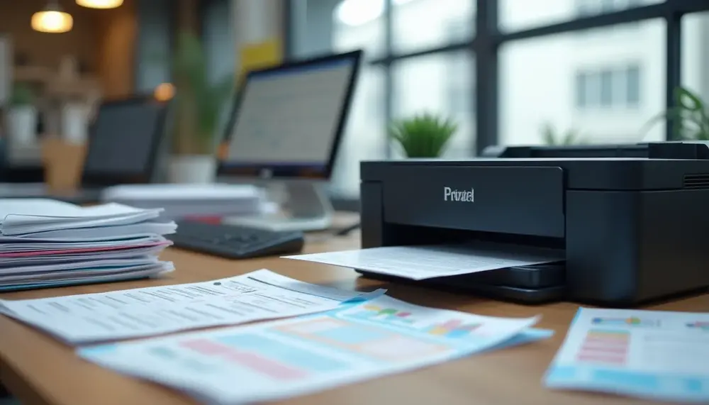
Choosing the wrong file format before sending a document to print is one of the most expensive mistakes in production workflows. A file that looks perfect on screen can produce banding, color shifts, or resolution artifacts the moment it hits a RIP (Raster Image Processor). Understanding why specific formats exist — and what each one preserves or discards — is the foundation of any reliable print process.
PDF/X: The Industry Standard for a Reason
PDF/X is not simply a PDF with a different extension — it is a strict subset of the PDF specification developed specifically to eliminate the variables that cause print failures. PDF/X-1a enforces CMYK-only color spaces and embedded fonts, making it the safe choice for offset printing where RGB elements would be converted unpredictably by the press operator's software. PDF/X-4, introduced with PDF 1.6, supports transparency natively and ICC color profiles, which is essential for modern digital presses and wide-format output. When submitting files to commercial printers, always confirm which PDF/X substandard their workflow supports — delivering X-4 to a shop running legacy X-1a workflows will cause processing errors.
Flatten transparency before export if you are targeting older RIP systems. Unflattened transparency in a standard PDF can produce white boxes, missing elements, or incorrect blending when the RIP processes the file sequentially. Adobe Acrobat's preflight tool will flag these issues, but the correction must happen in the originating application — InDesign, Illustrator, or Affinity Publisher — not in Acrobat itself.
TIFF, EPS, and When Raw Formats Still Matter
TIFF (Tagged Image File Format) remains the gold standard for raster image archiving and high-resolution photo reproduction. A TIFF at 300 DPI in CMYK with no compression is lossless — what you save is exactly what gets printed. LZW compression within TIFF is acceptable for most workflows, but JPEG compression inside a TIFF container defeats the purpose entirely and introduces the same artifacts you'd expect from a standard JPEG. For photographic content destined for high-end offset, request 300–400 DPI at final print size; for large-format banners viewed from a distance of 2 meters or more, 100–150 DPI at output size is genuinely sufficient. If you are preparing files for retail or copy-center environments, understanding which file types specific printing services accept and optimize for will save you multiple rounds of rejected submissions.
EPS (Encapsulated PostScript) is a legacy format that still appears in signage and textile printing workflows. It handles vector data reliably, but lacks modern color management support and cannot embed ICC profiles. Use it only when a vendor explicitly requires it — otherwise, PDF supersedes EPS in every practical regard. For large-format output such as banners and exhibition graphics, the format decisions become more nuanced; preparing banner files correctly involves balancing resolution, color mode, and bleed margins in ways that differ significantly from standard document printing.
- PDF/X-1a: CMYK only, fonts embedded, no transparency — use for offset litho
- PDF/X-4: Supports ICC profiles and live transparency — use for digital and wide-format
- TIFF (uncompressed or LZW): Ideal for raster images at 300+ DPI for close-viewing print
- EPS: Legacy vector format, use only when explicitly required by the vendor
- JPEG: Acceptable only for proofing; never for final print-ready file delivery
One practical rule: always export your final file from the native application rather than converting between formats. Each conversion step introduces the risk of color profile stripping, font substitution, or resolution resampling. Build the export settings correctly once, save them as a preset, and apply them consistently across every project.
Color Mode Decisions: When to Use CMYK vs. RGB in Document Formatting
Choosing the wrong color mode is one of the most costly formatting mistakes a designer or document creator can make — not because it's difficult to fix early, but because it's often discovered only after a print run delivers muddy purples instead of vivid blues. The core issue is physics: RGB (Red, Green, Blue) is an additive model built for screens that emit light, while CMYK (Cyan, Magenta, Yellow, Key/Black) is a subtractive model that describes how physical inks absorb light on paper. These two systems do not map to each other cleanly, and treating them as interchangeable is a reliable path to disappointing output.
RGB: The Right Choice for Screen-Only Documents
Anything designed to be viewed exclusively on a monitor, smartphone, or projector should stay in RGB. This includes web graphics, email newsletters, digital presentations, and social media assets. RGB has a significantly wider color gamut than CMYK — it can represent approximately 16.7 million colors, many of which simply cannot be reproduced with physical ink. Neon greens, electric blues, and vivid oranges that look stunning on a calibrated display will shift noticeably when converted to CMYK for print. Designing in RGB and sending files to a commercial printer without converting them first forces the RIP (Raster Image Processor) software to perform an automatic conversion, and those automatic conversions are rarely as precise as a manual, profile-aware conversion done in Photoshop or Illustrator.
When working with PDFs intended for digital distribution, keep your document in sRGB — the standard color space for the web — rather than Adobe RGB, which targets professional photographers and can look oversaturated or inconsistent across non-calibrated consumer displays. Understanding which file formats and color profiles different print and digital workflows expect is essential; resources that explain which file specifications retail print services actually require can save you from submitting the wrong configuration entirely.
CMYK: Non-Negotiable for Print Production
Any document destined for offset printing, laser printing, or commercial digital print production must be converted to CMYK before final export. Starting in CMYK from the beginning of your workflow — rather than converting at the end — gives you accurate soft-proof feedback throughout the design process and prevents late-stage color surprises. A common benchmark: total ink coverage (TIC) should not exceed 300% for offset printing and is often capped at 240–280% for digital presses to prevent ink saturation, drying problems, and paper warping.
For large-format work like banners and signage, CMYK becomes even more critical because the output devices are highly sensitive to color space mismatches at scale. A file submitted in RGB for a 3-meter banner will often print with visibly desaturated reds and shifted skin tones. Reviewing proper file preparation techniques for large-format banner printing clarifies exactly how color mode interacts with resolution and bleed settings in those high-stakes environments.
Practical rule: set your document's color mode before placing any images. Converting a fully built RGB layout to CMYK at submission time can shift every linked image, gradient, and spot color simultaneously. Black text in CMYK should use pure K (0-0-0-100), not rich black (which combines all four channels), to avoid registration issues on body copy smaller than 12pt.
- Use RGB for websites, digital PDFs, app interfaces, and video thumbnails
- Use CMYK for brochures, business cards, posters, packaging, and any offset or digital press output
- Embed ICC profiles (e.g., ISO Coated v2 for European offset, SWOP for North American) to give printers accurate color intent
- Avoid automatic RGB-to-CMYK conversion by prepress software — always convert manually with the correct output profile
Advantages and Disadvantages of Proper Document Formatting
| Advantages | Disadvantages |
|---|---|
| Enhances readability and comprehension for the reader | Can be time-consuming to set up and maintain consistent formatting |
| Establishes credibility and professionalism in documents | Requires knowledge of formatting standards and guidelines |
| Reduces cognitive load, making it easier to absorb information | Potential for over-formatting, leading to distraction |
| Facilitates the communication of ideas through visual hierarchy | May involve learning and using specialized software tools |
| Improves efficiency in document review and editing processes | Could lead to inconsistent outcomes if not regularly checked |
Resolution Requirements Across Document Types: DPI Guidelines for Office, Banner, and Commercial Print
Resolution is the single most common source of print failures that look perfectly fine on screen. The disconnect happens because monitors typically display at 72–96 PPI, while professional print processes demand anywhere from 150 to 2400 DPI depending on substrate, viewing distance, and reproduction method. Getting this wrong costs real money — reprinting a 500-unit brochure run because images look pixelated isn't a theoretical risk, it's a weekly occurrence at commercial print shops.
Standard Office and Commercial Document Resolution
For office documents — letterheads, reports, presentations destined for laser or inkjet output — 300 DPI at final print size is the non-negotiable baseline. This applies to all embedded raster images, logos saved as JPEGs or PNGs, and any photographic content. A common mistake is embedding a 72 DPI web image into a Word document and assuming the printer will compensate. It won't. The output will show visible pixelation, particularly around diagonal edges and text overlaid on photography.
Commercial offset printing for brochures, catalogues, and marketing collateral typically operates at 300–350 DPI for process color (CMYK) jobs. However, line art — think black-and-white illustrations or technical diagrams — requires 1200 DPI minimum to reproduce clean edges without stairstepping artifacts. When submitting files to a commercial printer, always confirm their specific requirements. Shops running Heidelberg presses often have different pre-press tolerances than digital print-on-demand operations. When you're preparing files for retail print services, understanding which file formats and resolution settings different print providers actually accept prevents costly last-minute corrections at the counter.
Large Format and Banner Print Resolution
Banner and large-format printing operates under completely different physics. A vinyl banner viewed from 3 meters away only needs 72–100 DPI at final output size — but here's where most people miscalculate. "Final output size" for a 3×1 meter banner means your source file should be set to those exact dimensions at the required DPI, not scaled up from a smaller document. A 300 DPI A4 file scaled to banner dimensions in the RIP software will still print at effective low resolution.
The practical workflow for large format is to work at 1:10 scale at 720 DPI — a 3-meter banner becomes a 30cm working file. This preserves design precision while keeping file sizes manageable. Outdoor billboards viewed from 10+ meters can drop to 25–50 DPI at actual size without visible quality loss. For indoor trade show graphics viewed at arm's length, push to 150 DPI at actual dimensions. The detailed approach to preparing these files correctly — including color profiles and bleed settings — is covered thoroughly in how to structure banner print files for consistently sharp results.
- Office laser/inkjet output: 300 DPI minimum for all raster content
- Commercial offset printing: 300–350 DPI for photos, 1200 DPI for line art
- Large format banners (viewed at 2–3m): 72–100 DPI at final size
- Indoor exhibition graphics (arm's length): 150 DPI at actual dimensions
- Billboards (10m+ viewing distance): 25–50 DPI at actual size
One reliable diagnostic before submitting any file: use Photoshop's Image Size dialog with "Resample" unchecked to verify true resolution at print dimensions. If the DPI drops below your target when you enter the final print width, you're working with insufficient source resolution that no software interpolation will adequately fix.
Page Orientation Configuration: Controlling Portrait and Landscape Output Across Applications
Page orientation mismatches are among the most persistent and frustrating formatting failures in professional document workflows. A report designed in landscape mode prints in portrait, a single slide deck page forces an entire print job into the wrong orientation, or a PDF viewer silently overrides the document's embedded settings. Understanding where orientation is actually controlled — and which layer takes precedence — is the foundation for reliable output.
The Three Layers of Orientation Control
Orientation is defined at three distinct levels: the document itself, the application's print dialog, and the printer driver. Each layer can override the one below it, which is why a document set to landscape can still print in portrait. In Microsoft Word, orientation is stored as a section-level property, meaning a single document can contain both portrait and landscape sections simultaneously — a feature that breaks down predictably when users don't understand section breaks. The application's print dialog introduces a second override point: many users inadvertently change orientation there, not realizing it conflicts with what's encoded in the document.
Printer drivers add a third complication. PostScript and PCL drivers handle orientation flags differently, and some enterprise print servers strip or reinterpret orientation metadata entirely. This is especially common in managed print environments where IT policies standardize output settings. If you're consistently seeing orientation mismatches in a corporate context, the driver layer is the first place to investigate — not the document itself.
Application-Specific Behavior You Need to Know
Microsoft Word, Excel, PowerPoint, and Adobe Acrobat each handle orientation with different degrees of reliability. Word's section-based model is the most granular but requires correct section break placement (next-page breaks, not continuous) to function as intended. Excel determines orientation per worksheet, not per workbook — a detail that catches many users when printing multi-sheet workbooks where individual sheets have different orientations. PowerPoint applies orientation globally to the entire presentation, meaning mixing portrait and landscape slides requires either splitting the presentation or using a workaround like embedded PDFs.
One scenario worth particular attention is when a document configured for landscape mode still outputs in portrait — this almost always points to a conflict between the document's embedded settings and a printer driver default or print dialog override. Resolving it requires checking all three layers methodically rather than randomly adjusting settings.
Adobe Acrobat and PDF readers introduce their own complexity. The "Auto-Rotate and Center" option in Acrobat's print dialog is enabled by default and will rotate pages to match the selected paper orientation, effectively ignoring the PDF's embedded page rotation values. For documents where orientation is critical — technical drawings, wide-format tables, architectural plans — this option must be explicitly disabled before printing.
- Word section breaks: Always use "Next Page" section breaks when switching orientation mid-document; continuous breaks don't create the page boundary needed for orientation changes.
- Excel sheet orientation: Set orientation via Page Layout → Orientation per sheet, then verify in Print Preview before sending the job.
- Acrobat Auto-Rotate: Disable in File → Print → Advanced to preserve embedded orientation values.
- Driver defaults: Check the printer's "Printing Preferences" at the OS level — these persist across applications and frequently override document settings.
Orientation problems also interact with other formatting issues. A landscape section that doesn't break cleanly can generate unexpected blank pages, and understanding why blank pages appear at section boundaries is directly relevant when troubleshooting orientation-related layout failures in Word. The root cause is typically an empty paragraph on the wrong side of a section break, which the application renders as a full page in the preceding section's orientation.
Margin, Section Break, and Page Layout Errors That Corrupt Print Output
Page layout errors are among the most frustrating formatting problems because they often only surface at the printer — after you've already sent the file. A document that looks clean on screen can produce misaligned output, swapped orientations, or phantom blank pages the moment it hits physical paper. The root causes are almost always the same: conflicting section properties, margin inheritance gone wrong, or layout settings that Word or InDesign resolved silently on screen but cannot translate cleanly to a print driver.
Section Breaks as the Hidden Source of Layout Chaos
Section breaks are the most powerful and most misused layout tool in word processors. Each section in a Word document can carry its own margin set, paper size, orientation, header/footer configuration, and column layout. The problem arises when sections inherit conflicting properties or when a section break is deleted without understanding what it was controlling. Deleting a "Next Page" section break between a portrait and landscape section, for example, immediately collapses both sections into one — and the surviving section adopts the properties of the one that followed the break, not the one before it.
A practical check: open the Reveal Formatting pane (Shift+F1 in Word) and click into each section individually. Verify that margins, paper size, and orientation match your intent for every section independently. Documents assembled from multiple source files are especially prone to carrying in conflicting section definitions that nobody notices until print time. Standard U.S. business documents use 1-inch margins on all sides; legal templates often drop to 0.75 inches on the sides. When these two templates get merged, you can end up with mixed margin sets that shift text blocks unpredictably across pages.
Orientation Mismatches and Margin Overrides
One of the most counterintuitive failures in document printing is when a file set to portrait orientation partially or entirely outputs in landscape — or vice versa. This typically happens because a section-level orientation override is embedded in the document that the print dialog doesn't visually surface. If you've ever wondered why a document is printing sideways despite your portrait setting, the culprit is almost always a rogue section property that survived a copy-paste operation or template merge.
Margin errors interact directly with this problem. If your printable area margins are set narrower than the printer's minimum non-printable zone — typically 0.25 inches on consumer printers, 0.125 inches on production equipment — the printer either clips the content silently or scales the entire page down to compensate. Always check your printer's actual minimum margin spec and build in at least 0.1 inches of clearance beyond it.
Blank page generation is another direct consequence of layout misconfiguration. A section break set to "Odd Page" or "Even Page" forces Word to insert a blank page to maintain the required parity — intentional in book layout, catastrophic in business reports. If you're dealing with unexpected extra pages appearing in your printed output, auditing your section break types is the first diagnostic step, not the last.
- Always use Print Preview at 100% zoom before sending to printer — screen rendering at reduced zoom masks margin clipping
- Replace "Odd/Even Page" section breaks with "Next Page" breaks unless you're producing bound, two-sided documents
- After merging documents, run a full section-by-section audit using the Navigation Pane combined with Reveal Formatting
- Set document margins explicitly in every section — never rely on template defaults carrying through a copy-paste operation
Driver, Firmware, and Application Settings That Override Your Document Formatting
Even a perfectly formatted document can print incorrectly when printer drivers, firmware, or application-level settings silently override your specifications. This is one of the most frustrating failure points in document production because the problem is invisible at the file level — your PDF or Word document looks exactly right, but the output doesn't match. Understanding where these overrides happen and how to intercept them is essential for anyone who needs consistent, predictable print results.
How Printer Drivers Silently Reinterpret Your Settings
Printer drivers act as interpreters between your document and the physical hardware, and they carry their own default settings that can conflict with yours. A common scenario: your document specifies A4 at 210×297mm, but the driver defaults to Letter (216×279mm) — the result is a 6mm crop at the bottom of every page, often cutting off footers or signatures. This mismatch is especially common in cross-regional workflows where hardware was configured for North American paper standards. Always verify driver-level paper size settings independently from your application settings; they are separate configuration layers that must match.
Duplex printing defaults are another frequent source of override. Many enterprise printers ship with duplex enabled at the firmware level, meaning single-sided documents may print double-sided regardless of what your file specifies. Similarly, N-up printing (multiple pages per sheet) can be activated at the driver level, compressing your carefully spaced layouts into illegible thumbnails. Before any critical print run, open the printer's properties dialog — not just the application print dialog — and confirm that duplex, N-up, and scaling are all set to match your document's intent.
Firmware updates can introduce new default behaviors without warning. A Canon or Ricoh multifunction device that processed your files correctly for two years may behave differently after a firmware push from IT. One well-documented issue involves auto-rotation features in newer firmware versions: the printer detects that a page's content orientation doesn't match the loaded paper and rotates the output by 90 degrees. If you've ever experienced a situation where your document prints in landscape even though it was set to portrait, firmware-level auto-rotation or driver orientation settings are the primary culprits to investigate.
Application-Level Print Dialogs and PDF Export Pipelines
Microsoft Word, Adobe InDesign, and Google Docs each have their own print pipeline logic that can introduce settings conflicts. Word's "Scale to fit paper" option, enabled by default in many installations, will silently resize your document if it detects a paper size mismatch — your 12pt body text may render at 11.3pt without any warning. In InDesign, the "Print as Bitmap" option can flatten transparency correctly but also degrades sharp vector text. Always export to PDF as an intermediate step and treat the PDF as the canonical version for print submission.
Third-party print bureaus and online services add another configuration layer. Their RIP (Raster Image Processor) software applies its own color profiles, bleed handling, and resolution settings. When submitting files to external vendors, choosing the right file format for professional print services determines how much control you retain over these downstream processing steps. PDF/X-1a and PDF/X-4 standards exist precisely to limit the variables a RIP can introduce.
- Check driver settings independently from application print dialogs — they are separate configuration layers
- Disable auto-rotation and auto-scaling at both driver and firmware level for predictable output
- Export to PDF/X before submission to external print services to constrain RIP overrides
- Document your driver version alongside your file version when archiving print-ready assets
- Request a proof print on the exact hardware being used for the final run, not on a substitute device
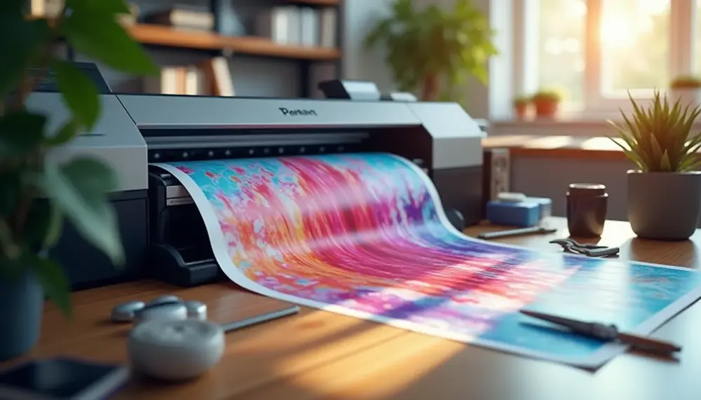
Large-Format Document Formatting: Scaling, Bleed, and Safe Zone Specifications
Large-format printing operates under a fundamentally different set of rules than standard desktop output. A document that looks perfectly formatted at A4 suddenly reveals every technical shortcut when stretched across a 3-meter banner or a 1200mm × 1800mm exhibition display. The physics of scale expose problems that smaller formats simply absorb — pixelation, color banding, and edge crops that destroy your layout. Getting the specifications right from the start saves you from expensive reprints and missed deadlines.
Resolution, Scaling, and the Effective PPI Problem
The most persistent misconception in large-format work is treating resolution as an absolute value. A file set to 300 PPI at A4 does not maintain that resolution when scaled to billboard dimensions. Effective resolution — the actual pixel density at the final output size — is what matters. For a pull-up banner at 850mm × 2000mm, 100–150 PPI at final size is typically sufficient because viewing distances exceed 1.5 meters. Outdoor banners viewed from 5+ meters can work at 72 PPI at final dimensions. When preparing files for high-quality banner output, the relationship between native file resolution and intended print size must be calculated before you build the document, not after. Professionals working with large vinyl or fabric substrates follow established workflows for banner file preparation that account for this scaling logic from the initial document setup.
Always create your document at the actual intended print dimensions rather than scaling up at the print stage. A 1:10 scale workaround — building at one-tenth the size and setting resolution to 10× the target PPI — is acceptable for extremely large formats where software performance becomes an issue, but requires meticulous documentation of the scaling factor for your print provider.
Bleed Margins and Safe Zone Requirements at Scale
Bleed specifications in large-format work scale proportionally with the output size, but not always linearly. Standard commercial print uses 3mm bleed; large-format substrates typically require 5–10mm bleed, with some roll-up banner mechanisms requiring 15–20mm on the bottom edge specifically to account for the cassette housing. Safe zones — the inset area within which all critical content must reside — should be set at a minimum of 15mm from the trim edge on signage and 25mm on outdoor banners subject to wind flutter and installation variation.
- Pull-up banners: 5mm bleed on sides and top, 50–80mm bleed on the bottom (cassette roll margin), 20mm safe zone on all active edges
- Fabric displays: 20–25mm bleed to accommodate wrap-around frames and silicon edge graphics (SEG) channels
- Outdoor vinyl: 10mm bleed minimum, with eyelets typically placed 50mm from the finished edge — keep all text 60mm clear
- Window graphics: 3–5mm bleed, but verify substrate direction with your printer as some materials have print-side orientation requirements
Color profile selection is equally critical at this scale. CMYK with Fogra39 or GRACoL 2013 remains the standard for solvent and UV flatbed printing, while some latex printers maintain their own ICC profiles that your supplier should provide. Submitting RGB files to a large-format RIP creates unpredictable color shifts, particularly in flesh tones and brand-specific Pantone approximations. When working with providers like Officeworks for large-format output, understanding which file formats their systems handle correctly prevents last-minute conversion issues that alter your color values. PDF/X-4 remains the safest submission format across most large-format providers, preserving transparency handling and embedding all necessary color data without relying on the receiving system's defaults.
Pre-Flight Checks and Preflight Tools: Validating Document Formatting Before Submission
Submitting a document without running preflight checks is the print equivalent of sending an email without proofreading — except the consequences are measured in wasted print runs, delayed deadlines, and real money. Preflight validation originated in commercial printing workflows, where catching errors before a job hits the press can save thousands of dollars. Today, even single-document workflows benefit from the same systematic approach, whether you're sending a file to a local copy shop or a large-format banner printer.
What Preflight Actually Checks
Preflight is not just spell-checking your content. A proper preflight process interrogates the technical structure of your file: color profiles, embedded fonts, image resolution, bleed settings, and output intent. Adobe Acrobat Pro's built-in preflight tool allows you to run predefined profiles — such as PDF/X-1a or PDF/X-4 compliance — and receive a line-by-line report of every deviation. For most commercial print jobs, PDF/X-1a remains the gold standard for press-ready files because it enforces CMYK color space and embedded fonts, eliminating ambiguity on the output side. If you're working with a service provider that has specific requirements — and many do — understanding which file formats your print provider actually prefers is a prerequisite before you even open your preflight tool.
Image resolution is one of the most common failure points. Preflight tools flag images below 300 DPI at final output size, but the subtler issue is effective resolution: an image placed in InDesign at 200% of its original size now renders at half its native DPI. A 300 DPI source image scaled up becomes a 150 DPI output — technically below threshold but invisible to a basic file check unless your preflight profile explicitly tests effective resolution. Set your preflight profile to check effective PPI, not just document PPI.
Practical Preflight Workflow Before Submission
Run your preflight in layers, not all at once. Start with a structural check: page count, document dimensions, bleed values (typically 3mm for standard jobs, up to 5mm for large-format), and trim marks. Then move to a content check: fonts embedded or outlined, spot colors converted to process if required, no RGB images remaining in a CMYK document. Finally, run an output intent check to confirm the correct ICC profile is assigned. For large-format output specifically, banner printing workflows have distinct resolution and color profile requirements that differ significantly from offset print standards — treating them identically is a consistent source of errors.
Beyond PDF preflight, don't overlook document-level issues in your source files. Word and PowerPoint documents are notorious for hidden formatting artifacts that survive export. A misplaced section break or an empty paragraph formatted with a large font size can push content onto an unwanted extra page. If you've ever puzzled over where that phantom blank page in your Word document comes from, you already know that source-file hygiene is as important as PDF validation.
- Use Acrobat Pro's Output Preview to simulate how colors will appear under press conditions before finalizing.
- Check overprint settings — unintended overprinting can cause black text to knock out incorrectly or rich blacks to appear muddy.
- Verify page geometry by confirming that TrimBox, BleedBox, and MediaBox are explicitly defined and correctly nested.
- Test with your printer's own preflight profile when available — many commercial printers provide downloadable Acrobat preflight droplets specific to their presses.
Preflight is not a last-minute formality. Integrate it as a mandatory checkpoint in your production workflow — ideally both at the layout stage and again after PDF export. Files that pass preflight cleanly communicate professionalism to your print provider and eliminate the back-and-forth that erodes deadlines. The ten minutes spent running a thorough preflight will consistently save more time than it costs.
FAQ on Correct Document Formatting
What is the importance of consistent formatting in documents?
Consistent formatting enhances readability, establishes credibility, and reduces cognitive load for readers, ensuring that the message is communicated effectively.
What file formats are recommended for print-ready documents?
PDF/X-1a and PDF/X-4 are the preferred formats, as they ensure embedded fonts and consistent color profiles, minimizing print failures.
How can color modes affect document printing?
Using the incorrect color mode can result in colors shifting significantly during printing. CMYK is necessary for print, while RGB is suitable for digital formats.
What are the recommended DPI settings for various document types?
For office documents, 300 DPI is the minimum; commercial prints generally require 300-350 DPI; large formats can range from 72-150 DPI depending on viewing distance.
Why is it essential to run preflight checks before printing?
Preflight checks validate aspects such as color profiles, resolution, and embedded fonts, ensuring that documents meet printing standards and preventing costly errors.